Thursday, January 3, 2013

Kitchen Design: Layout, Location and Flow

   Kitchens... such a simple word.    

Kitchens are places we used to sit around as kids while Mom whipped up some of the fondest food memories of our lives.

Kitchens are also places you could run into right from the school bus, throw your back-pack on the counter, whip open the fridge hoping to find something better than the left-overs of last night's "fondest food memory" (Let's be honest, even Mom got it wrong sometimes)

Kitchens.

Now, as a homeowner, kitchens are... well, they're a nightmare.

Everybody wants the perfect kitchen, you know, a place where your close friends can hang out when you have those impromptu casual Friday night dinners? Where they all can't stop complimenting you on how open, spacious and inviting your kitchen is? And how wonderful all the food you prepared looks under the perfectly dimmed lighting of the seemingly limitless counter space you have? And how your kitchen was obviously built to prepare the finest Cuisine... not 'Quiz-ine'... 

(Please stand by for a word from Wiki-Focal-pedia)
                                                                                     
Quiz·ine  
/kwiˈzēn/

Noun
1. A style or method of cooking whereby guests are mystified as to what it could possibly be.
2. Food cooked in a certain way, usually lacking intention, skill or the necessary tools to prepare it with.

Synonyms:
mystery meat - frat house fricassee - sh*t-on-a-shingle  
                                                                                                                                   

(Now back to our blog)

Well all of that comes at a price and when it comes to renovations, kitchens are usually at the top of the budgetary food chain. So how do we take our kitchens to the next level? And how do we do it without completely breaking the bank?

We start with the layout.

A big mistake I see a lot of designers and contractors make is feeling the need to move EVERYTHING around. Now, in some circumstances that might be the correct answer but often things make sense right about where they were originally intended to be, give or take a couple of inches.
Let's take a look at a project that we here at Focalpoint Renovations just completed. The original kitchen wasn't really bad it was just... (here comes my favorite word)... Dated.

Take a look:
Kitchen cabinets before demolition


Here's another view looking through the kitchen into the adjoining living space.The hardwood flooring was actually installed in the opposite directions as the two rooms met making each room feel even more separated. That bothered my sense of flow from the beginning and as those who know me will tell you, "Know your flow!"

Island before remodeling

There is a bank of cabinets on the left there that was half a desk area combined with an awkward wine bottle display above. Let me show you that.

Original kitchen


Lord knows I understand sitting down to pay the bills could drive a person to drink but, I wasn't quite sure exactly what was happening here with this half desk/half wine cabinet area. What I did know was that we had some dated white thermofoil cabinets, Corian countertops and walls that were painted... um, I don't know. What are we calling that color, Blandberry? Mauve-itov cocktail? 
This kitchen spoke to me, but it spoke in the Microsoft language of Windows 98. It said things like, " Re-elect President Clinton" and "What's this new eBay thing I keep hearing about?"

In any case, the homeowner actually really liked white cabinets and wanted to stick with that look. 
So here was our challenge:  
Update the space without making it feel like we rebuilt the same kitchen... all over again. 

Oh, and we needed the budget to stay as trimmed as possible (that always seems to be the case, doesn't it?)

Step 1: Figure out what the customer wants and how much of the existing layout we can work with. 
Customer requests:

  1. Bigger island for entertaining
  2. More cabinet space
  3. Relocate Cook-top area
  4. Update lighting design
  5. Update fireplace


Existing locations:

  • Sink: Yup, that bugger sits nicely under the window looking onto the enclosed deck. You stay put.
  • Dishwasher: To the right side of the sink. This works great for the water & drain hook-ups and that's exactly where we will leave that little guy.
  • Oven: We have an updated, electric double oven that isn't very old, if we can utilize the relative location, we'll have our power requirements pretty much where we need them.
  • Cook-top: Sorry... you're in the island and we don't like you there anymore. You take up too much space and you have to go.
  • Refrigerator: You're in a tight spot too to the right of the double oven. If only we could find a new home for you so that everything wasn't sitting on top of each other.


The last request was to address the cobblestone fireplace in the adjoining living area. She never liked it because she felt it was bland, had a massive limestone mantle & hearth and she really wished she could somehow get a flat screen T.V. up there.

Beyond just the cabinet design, it becomes obvious they've set these two rooms up independently of each other. There is even a breakfast table with hanging light smack dab in the middle dividing the two rooms. Even though these rooms have no walls separating them, it sure seems that someone drew a line in the sand and never wanted the two to play together. If we could somehow stretch this kitchen towards the living area and make the living area feel more like an extension of the kitchen... well then, we just might have something!

 Here's where we begin to see opportunity

We have two entrances to the enclosed deck, a 6' sliding glass door in the kitchen and a 36" french door around the corner in the living area (you can see the slider in the second picture posted above). If we sacrifice that sliding glass door, we could extend our kitchen cabinets along that wall towards the living area and even get that bigger island she wanted. That would probably give us even more room to create a new Cook-top area somewhere along the wall instead of the island where it was. Heck, why don't we just relocate the fridge as well while we're at it?? 
Well, we did. (Notice I cut right to the chase, no drama. I'm no Steven King)

With the help of our friends at Cyr Lumber we utilized DeWils Cabinetry and here's what we came up with:

Built-in Thermador refrigerator

A beautiful built-in, Thermador stainless steel refrigerator and a gas cook-top with a cabinet enclosed hood vent. (We can't mention the cook-top without thanking our good friends at Tech Welding/Mad Mounts for punching out the custom stainless steel flange adapter to pop that puppy in place).
What about that sink area? We left it right where it was with a couple of fancier options such as instant hot water, water purification and in-counter mounted soap dispenser to clean away the memories of the previous kitchen design.

Cooktop and hood


Not everything got bigger, with the additional cabinetry, we were able to shrink the wine display area down to a more appropriate size, lose the desk feature and tie it together with a marble backsplash and beverage refrigerator below. Using varying depth sizes in the upper cabinets made the areas more interesting and got away from what I call, 'the bowling alley effect' where everything follows one continuous visual line.
Finally, this area says 'Entertainment' not 'Sit here and pay your insurance bill'.

Wine storage area


Another upside of having moved the refrigerator is that we were able to slide the double oven a few feet to the right of its original location, incorporate a microwave into the upper cabinetry and open up even more counter and cabinet space.

Double oven cabinet
All of these changes allowed us to build the real Focalpoint ™  of the kitchen (like what I did there?):
Our massive 4 seat, 10' 4" x 30" island. Fantasy cream granite offset in an antiqued black finish give this kitchen the much desired seating area that it was lacking.


Here is a view looking back into the kitchen from the living space:

Kitchen Renovation

The granite counter tops, stainless steel appliances and hardware, carefully located recessed lighting and pendants, and updated hardwood flooring (installed in the same direction as the living area) all helped to bring this room to life.

But there was still one element we wanted to take advantage of and that was the fireplace. It was a very interesting cobblestone but it was tall and narrow. The hearth felt very plain and the mantle was big and set fairly high.
We wanted to allow this fireplace to maintain some of it's original charm but I personally wanted it to feel wider and have more visual weight. We also needed to incorporate the ability to install a flat screen television so we came up with a fairly simple solution. Remove the mantle and the hearthstone, then build a surround that had some of the same character of the kitchen cabinetry. Installing an absolute black granite hearthstone helped make the other fireplace features pop.
The ultimate goal was to help draw the two rooms together and make them feel like one continuous larger room and less like two separate spaces.

We also smoothed out the ceilings. That circular swirl may have been fancy 15 years ago but now it just made me dizzy and anxious. Here's the fireplace before and after:

Fireplace before and after

And here's what the two rooms now feel like when you enter through the kitchen:

Kitchen Island

Adding a dropped light fixture and moving the breakfast table into the bay window area of the living space made for better views and comfort.

Living room renovation

Overall, we managed to make a lot happen by allowing elements of both rooms to compliment each other and taking advantage of what was already there. Part of me misses the 'Blandberry' paint? But then again, part of me still misses Nintendo and Doogie Howser, M.D.

Long live the 90's.


Wednesday, September 5, 2012

Masonry sealer: To Seal or Not To Seal?


Gbenga asked us an interesting remodeling question:  
"Does an exterior sealer on a brownstone have any negative effects on the home?"
Masonry sealer can be extremely beneficial to extending the life of most man-made and quarried stone. You didn't specify the application, but "brownstone" is typically a form of sandstone. Sandstone is a quarried stone that tends to be particularly porous and can deteriorate over time when exposed to inclement weather conditions. Sealing any porous stone can only benefit its lifespan.

The only negative (or perceived negative) that we have dealt with in a masonry sealer is it can alter the physical appearance of the stone itself. Much like the difference between a piece of unfinished wood and varnished wood, sealer can darken and change the sheen of a particular material so you need to keep that in mind when choosing a sealer. Check out the image below to see what I mean:

If you have the option, test the sealer on an inconspicuous area of the stone and let it dry so that you can judge whether or not you like the finish much the same way you would with testing a paint color before painting a room. The difference being you can always re-paint a room, removing sealer isn't as simple.

I would also offer that before you apply any sealer, make sure the surface is properly prepared. In an exterior application I recommend pressure washing the surface to help remove any residues or staining. In an interior installation, I would suggest a mild soap & water sponging of the surface followed by a clean water rinse. In either situation, allow the surface to dry completely before sealing.

Always choose a quality masonry sealer! There are lots on the market and not every sealer is right for each application so make sure you do some research and don't swap quality for cost. A decent sealer should provide years of protection.

Hope that helped and thanks for Asking A Home Improvement Expert!

Sunday, August 5, 2012

New England Style Steak and Chicken: Grilling tips for the Summer

Well Hello!
Boy, It's been a while since I've posted, huh? I know, that may be a good thing. It means we've been overwhelmed with work but you know how much I love you all so I'm here to discuss a VERY serious matter. Something that seems to have been overlooked by almost every other remodeling blog this season so far... BARBECUE TIPS!

Oh, you think I'm kidding?... If you had any idea of how many people are brutalizing perfectly good cuts of chicken and steak as we speak, your laughter would turn to tears.

Thankfully, I've been taking notes and I've had a particularly good grilling season so far.
So, I'm going to go right ahead and share some of my grilling insight with you so that your summer will end with all of your friends asking, "Can I PLEASE get YOUR Barbecue Recipes??"

Here we go... nice and easy....

Get yourself some decent, boneless cuts of either Chicken  (boneless breast) or steak (Sirloin strip). I'm showing Steak tips because we all know what a boneless chicken breast looks like.


Other things you need!

**Study this picture**... Nah, don't. I'm going to list most of the ingredients in the next few paragraphs. I just thought I'd make you pay extra attention. Then again, there are only six things in this picture. Isn't it worth looking?


Is that it? YUP! Those six ingredients (Salt excluded, I'll cover that in a minute) are the backbone to every GREAT marinade. Don't argue, just hear me out and do this in order.

You need to take the portions of meat you've purchased, remove the EXCESS FAT you see and cut them into somewhat equal pieces. Don't shoot for perfect sizes especially with steak, Just try to cut them into somewhat even chunks that you can work with. Bigger pieces will come out more  Medium/Rare when cooked on the grill.... smaller pieces will cook more Medium/Well Done.

Chicken, you can go for a more even size cut of meat (because there is no "medium rare" with chicken. You want your guests to enjoy your barbecue, not be calling you from the hospital letting you know that they survived)

And here comes the marinade recipe: 

  • 1/2 cup Canola oil 
  • 1/4 cup Red Wine Vinegar
  • 1/4 cup water (I love Poland Springs, Use something good)
  • 1/4Teaspoon of Pepper
  • 1/2  Teaspoons of Salt (this is actually a HUGE ingredient but everyone is so scared of salt? I'll leave it up to you to decide how much to use. I've given my input now run with it. You know what you like, let your taste-buds be the judge of how much you need)

You're done.

Wait... what? What do you mean "I'm done?? You have pictures of Oregano and Rosemary! How much of those do I need??"
Those are all just complimentary. Feel free to toss a shake of whatever you like into your particular marinade. I only ask that you taste it before you use it. Yes, I said taste it. It should taste much like a good salad dressing. I often like to add either Honey or Sugar (sweetness does wonders for a marinade!) to give it a little extra love before I saturate a good cut of meat. Meat is your friend, don't subject it to anything you wouldn't be willing to taste.

Like I said, you're done.
That's the basis of your marinade. Wasn't that easy?
Short sidenote: You should be very picky with your meat trimmings. Remove any excess fat your grocer missed when cutting your tips into perfect marinade-ready cubes.

Here's my biggest tip: Go get yourself some Zip-lock freezer bags. Take the meat you've bought and cut it as previously described.

Combine meat and marinade into neat "pillow" grilling bags AND.... You're Done! (Boy, I keep saying 'You're done' and continue to talk... I promise we're close to the end)

Here's what Steak should look like:


And here's Chicken:


Toss those Buggers into your fridge for a good 24 hours before grilling. Allow the meat time to marinate and when you think they are ready,  cook on a hot grill at medium/low temp and flip often until cooked to perfection. Cooking is the second hardest part and I will cover an entirely different post (ain't I a stinker?)
My point here is: DON'T PAY FOR PRE-MARINATED MEATS!  You can and SHOULD do this yourself!

TIP OF THE DAY:  Make sure you "play with your meat" *Giggle*
As the meat pouches sit in your fridge soaking up the goodness, make sure to fondle them often and allow all of the marinade to work it's way through the meat pillows. You know you like it, let your fingers do the walking. Reach in often and fondle them to work the marinade through the meat.

Happy Grilling!

Sunday, June 10, 2012

PAINT COLOR IDEAS: The Pottery Barn Effect


Jennifer H. asked us, "What paint colors work best in small rooms?"

Unfortunately, Jennifer didn't send us any pictures of what room she was trying to paint 
(it must be a secret... shhhh, don't tell anyone she's thinking about painting)
That being the case, I'm going to divulge a few tricks that I use to make almost ANY paint color look better.
I call it, The Pottery Barn Effect.

"But Daniel! I don't even shop at the Pottery Barn!"
Settle down...it's okay, neither do I. What I'm referring to is something I noticed years ago in the way Pottery barn presents its products in its advertising.
Here, let me pull up a few images:

pottery barn paint color ideas


Okay, I'm surrounded by a bunch of 'Pottery Barn-esque' pictures. Keep in mind, not every color shown is a particular favorite of mine but they don't have to be. The images are designed to do one thing,
Make The Furniture Look Good.

The interesting thing I started to notice many years ago is that they use a very specific design style in a lot of their catalogs. Look past the furniture and focus just on the rooms, there are a few elements they tend incorporate in the background to help make their furniture look its best.
Notice any similarities yet? Here's what I noticed:


Most of the rooms that have "The Pottery Barn Effect" usually have flat white ceilings as well.
For some reason, I've chosen not to show any examples of that in these pictures.

I blame  Jennifer H. She started this whole
let's-not-submit-photos thing. I just didn't want her to feel left out.
Do those elements really make THAT much of a difference? Well, you decide. Take a look at the image below.


How many of you have seen or own a living space like this?

dark room trim

I'm sorry but, 1982 called and wants their everything back. Golden oak stain on the stairs, chair rails, baseboards, doors & windows.... don't stare at that picture too long, I think it comes with a Surgeon General's warning.
There is just nothing inviting about those harsh, dark, trim lines breaking up every single visual aspect of the room. It kind of reminds me of my parents old Country Squire station wagon.


Another open living space with "The Pottery Barn Effect"


Doesn't that just make your stomach feel a little better? (I know, you're welcome)
So how do we quickly achieve this effect?

Here are a couple of simple rules to follow when updating a room for paint


TRIM

Replace any existing baseboard, door & window casings with wider trim.


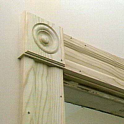
A lot of houses come with a traditional 2 1/2" colonial molding, try stepping it up to a 3 1/2" or maybe a belly-mold with bulls-eyes.
What's a belly mold?

Oops, that's a different type of belly mold


Here it is

They work great with bulls-eye corner blocks for some real extra flair. Also, there are a lot of taller baseboard moldings available. I personally like updating the old colonial baseboard to a 5 1/4" Speed Base.


PAINT

Use semi-gloss white paint for the trim.
When choosing a trim paint, most use either oil or latex (acrylic). Oil paint gives a smoother finish but can sag if applied to heavily. It can take more coats to cover and is harder to clean up as well. Latex paint works well but can show more brush marks as it dries faster. The upside is that it cleans up very easily with water. Either works, pick your poison.
When it comes to wall color, It's all about personal preference but if you frame it in white trim? I guarantee it'll look a lot more like the magazines you probably first saw the color in.

When choosing a wall paint, USE LATEX FLAT ENAMEL.

Paint comes in a lot of different sheens such as:
  • Gloss
  • Semi-gloss 
  • Eggshell
  • Satin
  • Flat 
and the one sheen we can never seem get away from.....


When you're painting interior walls, 99% of the time these walls (much like Charlie Sheen) are NOT going to be perfect. They never are, learn to accept it (Charlie has). Walls are usually built over wooden studs which crown, twist and bend. The seams of most wallboard are hand smoothed with either plaster or joint compound. Even the best plastered wall rarely holds up to a straight-edge.
Here's the problem: Higher gloss paints reflect light and when light hits those newly painted walls?
You guessed it... you see the imperfections.

Walls painted with a FLAT paint aren't nearly as reflective so they do a great job of hiding a lot of those little inconsistencies which will help your walls appear smooth and give your room a cleaner look. The reason I suggest flat ENAMEL is because certain walls tend to get more abuse.
In the past, a lot of painters would use an Eggshell paint in bathrooms & bedrooms. It was more durable and helped protect against the higher humidity you find in bathrooms and also in places where little hand-prints had a tendency to show up on walls.
Enamel paint has a lot of the same durability qualities as an Eggshell but none of it's reflective qualities so you can still scrub it a bit without pulling the paint off of the wall or ruining the finish.

When it comes to paint manufacturers, I was always a Benjamin Moore fan. Sherman Williams was a close second but since Home Depot acquired Behr Paints, they've made a lot of effort to make it a worthy competitor at a reasonable price. I've had great success using the Behr premium interior as well as exterior lines of paint. Their Premium Plus Ultra all-in-one primer & paint makes a lot of tough walls very easy to cover with only a couple of coats, a helpful quality for amateur painters.

Lastly, when it comes to ceilings? I always prefer flat white.
It keeps the room feeling open and airy which is especially helpful in a room with a lower ceiling height. Try to use a decent grade of ceiling paint so that it won't take as many coats to make your roller marks disappear.

LET'S REVIEW!
  1. Wide trim in semi-gloss white
  2. Flat enamel latex walls
  3. Flat white ceilings
Hey, guess what? You've learned the secrets of The Pottery Barn Effect! 
Make sure all of your outlets, receptacles and switch plates are all updated in white as well to tie the room together.

If you don't have any experience replacing outlets or switches, I always suggest you call a professional or Ask A Home Improvement Expert!
Jennifer H., I hope that answered your question and I really hope the ugly room picture I posted wasn't your house. Actually? I hope it was... someone seriously needs to paint that room.

-Cheers!

Sunday, May 20, 2012

FLOOR TILE: Does SIZE matter?

Janice T. sent this question to Ask A Home Improvement Expert:

"We've been thinking about changing the tile in our bathroom but we aren't sure which size tile we should use. Is smaller tile better for a bathroom?"


That's a great question!.... and it's nice to finally have a woman ask a man if size matters.
My personal opinion is that the more grout lines you have, the busier a floor looks. A lot of people grew up looking at their parents bathrooms with tiny mosaic tiles and mauve colored fixtures.
You've seen how your parents used to dress, do you really want to use their sense of style as a point of reference?


{{{shiver}}} Yikes......Anyway, I always start by trying to use the largest tile I can in a given room. The reason I start here as I said, is that more grout lines make a floor look busier and unfortunately
Busier = Smaller. I don't want a small room to feel even smaller, I want it to feel spacious and open. Larger tiles can make a small bathroom feel bigger. There is no rule saying you can't use 18" x 18" tiles in a 50 sq. ft. bathroom. It's all about the look you are trying to create. However! There are a few issues that can potentially sway the choice of tile size that  you should always take into account.

How level are your floors?

Run a level over your floor before you make any decisions to spot the inconsistencies in your floor and to see which way it may be pitching. Smaller tiles have the ability to conform to these inconsistencies. In a perfect world, you'd never want to have a floor with a lot of pitches and rolls but often in homes that are 150-200 years old, the best you can hope for is to minimize the motion of the floor. If you tried to get it back to perfectly level, you'd likely end up with a floor that's much higher in some areas than you want. This is especially troublesome when the doorway transition ends up being over an inch out of level (unless you enjoy watching your friends trip in and out of your bathroom). In these cases, we are try to get the floor to be as FLAT as possible... not as LEVEL.
Larger tiles such as an 18" x 18" are more difficult to lay flat due to the fact that each tile covers so much floor space. If the area you're working is a little higher in the middle of where a tile lands, you may find that corners of your tiles are left sitting up higher than you would like. Sometimes adjusting the layout of where your grout lines will land can help work around some of these problem areas.

Desired Effect

Is there any other tile in your room? If there is a specific tile pattern on your walls or shower, it may dictate how you want to approach your floor. There are common styles that people are trying to recreate or achieve that can help determine the floor tile. For example, A subway wall pattern: We often see a smaller mosaic tile pattern with subway-style tiled walls.


There are no hard and fast rules but, there are applications that you may have seen and are subconsciously trying to recreate.

If you are simply looking to update your floor, I  would suggest picking color before size. It's often more important to get the color you desire and you may find that the color you love? Isn't available in every size and shape. Your question may be answered before you ask it!

Bathroom usage

Is this a bathroom that gets a lot of family use? If it is, I would point out that for every grout line you create is also one you need to maintain. Grout needs to be cleaned and sealed according to usage, sometimes as often as once a year. A full bathroom with 5 family members and a dog that  you can't seem to keep clean no matter how many times you wrap him in plastic, will be subject to more water and soil on the floor than a half-bath connected to a guest room. (I'm kidding, don't wrap your dog in plastic.....kids are optional)
Fewer grout lines can also mean fewer possible areas for moisture to get through to the substrate if those grout lines ever open up over time. Remember: More grout lines = More maintenance.


Grout color

Grout color will affect your choice as well. There are two ways to go with grout color, one that blends or one that pops. Both have their advantages in certain situations but more often I try to find a grout color that blends with the color of the tile itself. This helps keep whatever floor tile I choose feeling like one consistent floor not like a bunch of smaller pieces. I see this mistake a lot, a bad grout color choice making a floor look too broken up. Example:

I also tend to avoid very light grout colors in favor of more neutrals because lighter grout colors are much more difficult to maintain and they discolor quickly. I only use white & off-white grout when it's specific to the effect the customer desires. Which brings me to my last point:

Personal preference

What do you like? I always ask potential customers to pick out a few pictures of bathroom floors that they think are cool. When a customer shows me three pictures of bathrooms all with larger style tiles or perhaps all with a particular pattern, it makes finding their solution simpler. Sometimes I even find they don't like the floors they've shown me at all, they actually like the color, layout or style of a room. It's important that whatever you pick works with the room itself and when in doubt? I would suggest that something simple, clean and neutral often works better than something bold and intricate. It also allows you to update other elements of the room over time without limiting your choices.

So, there are no universal answers but there are certainly considerations in making your choice. Try to ask yourself these questions before you make a decision or Ask A Home Improvement Expert!

As always, I'm Daniel and I'm a General Contractor. (<--- and that's still a link)

-Cheers!

Sunday, May 6, 2012

CAPTCHA: Why Do You Hate Me?

I remember a simpler time when the worst thing about spam was how to get it out of the can. Apparently, it's a much bigger problem now because every time I try to do anything online I get hit with a CAPTCHA. It stands for "Completely Automated Public Turing test to tell Computers and Humans Apart" and it was designed to cut down on SPAM (flooding the internet with copies of the same message). It stops software programs from abusing services and minimizes automated postings to blogs and such. 

You've all seen them. That tiny box of fuzzy words that you have to type in to virtually everything nowadays. It's sole purpose is to prove that you're an actual human being to complete your submission. Wonderful.

Here's my problem:

I'M HUMAN AND I CAN'T TELL WHAT THOSE WORDS ARE!


Let me give you a window into the hell that is my life. Just this morning, I was downloading a picture to use for an article and I was hit with this CAPTCHA:

CAPTCHA
Okay, this is no problem. It looks like "i" then.... wait, is that an "o"? I think it is. What if it isn't? I don't want to get this wrong and have to retype my information. 
Hang on, they have a little recycle button just to the right of the submission box. Let me hit that and get new words:

Huh? Why are those numbers are upside down? Do I type them in that order or am I supposed to flip them and type them in the other way? Hang on, let me get a new one:


Whoa! What's that inkblot on the right? How do I.... is that....... am I supposed to type that? Im really confused, this is starting to feel like a Rorschach Test. 
Wait, there is a little speaker button there! Will that let me HEAR what I'm supposed to type? That's perfect! Let me hit that button....


 *SATANIC-BACKWARDS-MASKING-EVIL-IS-UPON-US-I-HEAR-DEAD-PEOPLE!!!*


OH MY GOD!!............... That was a HUGE mistake!!............................Let's just stick to the letters! 

*hitting the recycle button again*
 

Come On!! I don't even know what language that second part is! Do I even have a key on my keyboard for that?? NEXT!


ARE YOU SERIOUS RIGHT NOW?? What the HELL is that?! That's not even a word, its a PICTURE!! Is that a building?? Do I type in "building"?? Why is it so out of focus and why are they showing me pictures?! NEXT!!

STOP!! I can read it!! YES! Oh dear Lord thank you.... Thank you!.... Stay right there, let me just type that in, 'passage toniets'.....

"Incorrect security code entered, please try again"


Wait, what?? Oh God no... I typed it in wrong! I had the perfect CAPTCHA and I blew it! I BLEW IT!! Please, please, please.... I'm begging you, give me another easy one. I won't ever talk bad about CAPTCHA again if you just give me one more easy one..... pretty please......

*Hitting recycle with my eyes shut*


........... I so hate you right now......................


Daniel Batal is a Remodeling Contractor and owner at Focalpoint Renovations


My Zimbio
Image: David Castillo Dominici / FreeDigitalPhotos.net

Wednesday, May 2, 2012

7 Amazing Gadgets You Must Have!

What does a Contractor do on a very rainy Wednesday morning? He surfs the internet and finds the coolest stuff ever and shares it with you! May I present my Top 7 in no particular order (I thought five wasn't enough and ten was just plain excessive...)

The Jellyfish Aquarium


Forget the shark tank, here's a 7 gallon acrylic tank that comes with it's own built in lighting and filtration system from Jelly Fish Art.  The entry level package with one moon jellyfish and a 3 month supply of food starts at $382.00, but if your wallet is feeling particularly fat, you can opt for the $709.00 deluxe package. 
Deluxe package Includes:
  •     Desktop Jellyfish Tank
  •     3× Large Moon Jellyfish
  •     12 Month Food Supply
  •     2× Red Leg Hermit Crab
  •     2× Cleaner Snail
  •     Algae Cleaner Magnet
  •     Water Quality Test Kit
  •     Aquarium Salt (10 Gal)
  •     Water Heater
  •     Floating Thermometer
  •     Nutrafin Cycle 1oz
  •     Clear Vacuum Hose
  •     Substrate
No mention of having a second person to pee on you in case you get stung.... It would be worth having just to say to people, "I have to get home to feed my jellyfish" and watch the expressions on their faces. In fact, you could capture those expressions with this...

iPhone Tri-lens


If you're an aspiring photographer or just want to make your iPhone look like it's having its eyes checked.... this quirky little device from Photojojo might rank high on your list of 'must-haves'. The iPhone lens dial spins to offer three optical-quality coated glass lenses: Telephoto, Wide Angle and Fish-eye. The aluminum housing also comes equipped with a tripod mount for landscape and portrait shots. Priced at $249.00 (that's only $83/lens if you're trying to justify buying one) Or maybe you prefer something a little more silly...


BANG! (Shoot the light out)


My girlfriend spotted this one from Bitplay. It's as simple as it looks. This desk lamp comes with a gun shaped remote that you "shoot" the light on and off with. When the lamp is shot to OFF, the lampshade tilts to the side in its "wounded" position.... The shade stands back up and the light comes on when in reverse. All this fun can be yours for a mere $336.00. Okay, maybe that one was too silly. Maybe you prefer something more suited to your sophisticated tastes. How about this inconspicuous device:

Nest Thermostat


"Daniel, what's so cool about a thermostat?" Well, nothing usually but this Nest Thermostat only needs you to adjust two settings: Up & Down. Over the course of about a week, it creates a program based on the temperature changes you've made. It continuously adapts to your adjustments and offers information such as how long it will actually take before you room comes up to the desired temperature. It also signals energy saving actions with its 'Nest Leaf' logo whenever you perform them. Much like the Terminator, this is a learning machine, but this machine will cost you $249.00. Speaking of the Terminator, let's replicate something...

MakerBot 3D Replicator


Tired of two dimensional printing? Why not make your prints come to life with The MakerBot Replicator™,  the ultimate personal 3D printer. MakerBot gives you the ability to extrude your design in single or dual-color ABS plastic with a build space equal to the size of a loaf of bread. The best part about this device is the list of warnings it comes with on the website. I haven't seen such a potentially dangerous device since the Flux Capacitor or...... the Easy-Bake Oven. Just imagine what trouble you could cause for only $1,749.00. What, do you think dangerously cool gadgets are all too expensive? Well then, take a gander at this...

Evergreen Mp3 Player


Haven't we seen enough mp3 players? Yup, but the "DN-2000" from Evergreen can attach to your keychain and plays music directly from SD-memory cards (1GB max) for up to 5 hours on a single AAA battery. Those stats may not be very impressive, but this one is... The price: $8.50. It's the closest I've seen to a disposable digital music player. I'm sorry, are you too old-school for digital music? Maybe this next one is more your speed....


Soundwagon Portable Mini Record Player


The name says it all. Tired of watching your vinyl spin? Why not give them a break and let the Soundwagon do it for a change. This officially licensed VW minibus model is a fully-functional, battery powered phonograph player. It's contains a needle, amplifier and speaker that will run laps around your LP's... that's if your brave enough to turn your precious collection into a race track. $99.00 puts you behind the wheel of this micro-magic......

So, there are my top 7. I'm always on the look out for anything cool and unusual so please, feel free to drop a comment or link below if you've got something unique or kooky that we should all know about... like a machine to make it stop raining.

Cheers!